Case Study
TaskHive SaaS Platform
Designing a high-converting website and transparent pricing architecture for a remote team productivity platform.
Role
UI/UX Designer
Project Type
SaaS Website & Pricing Design
Pages Designed
Homepage & Pricing Page
Platforms
Desktop & Mobile Web
Tools Used
Figma, Notion, FigJam
Core Focus
Conversion Optimization & IA Clarity
Chapter One
Product Overview & Strategic Goals
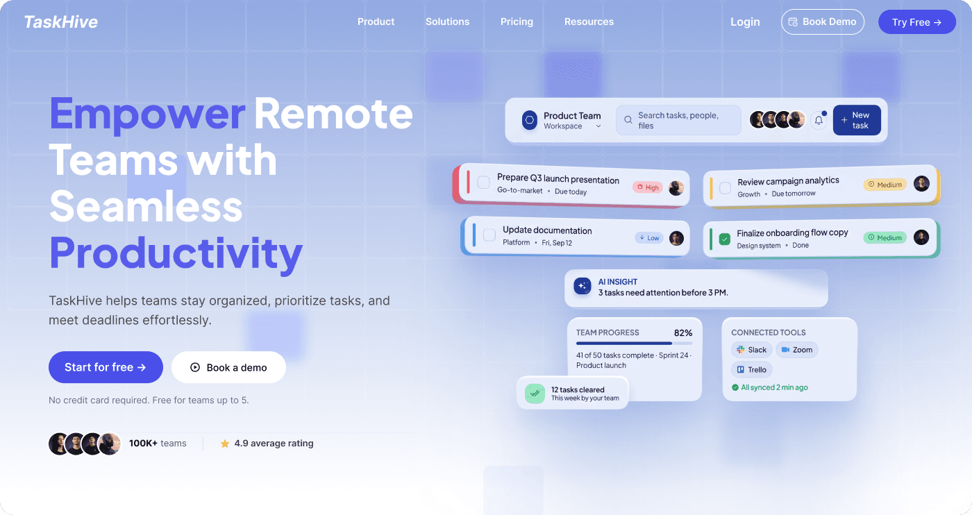
TaskHive is a productivity SaaS platform crafted for distributed, asynchronous teams. It bridges fragmented workflows by unifying task management, timeline tracking, and seamless integrations with everyday tools like Slack, Zoom, and Trello.
Core Business Objectives
- Communicate the value proposition within the initial 5 seconds of scanning.
- Build trust with social proof, customer logos, and real dashboard previews.
- Remove friction from plan comparison to accelerate free trial conversions.
UX Priorities
- Create strong visual hierarchy and distinct call-to-action prominence.
- Deliver seamless parity between desktop and mobile viewport experiences.
- Eliminate hidden pricing details and unclear tier limitations.
Chapter Two
Problem Space & UX Approach
Pain Point 01
Scattered Information
Teams lose time switching between chat apps, spreadsheets, and standalone kanban boards.
Pain Point 02
Coordination Overhead
Remote standups and status updates interrupt deep work without improving alignment.
Pain Point 03
Priority Blindspots
Unclear task hierarchy causes bottlenecked deliverables and missed customer deadlines.
Pain Point 04
Pricing Confusion
Users abandon SaaS checkouts when feature matrices hide per-seat costs or essential tools.
Chapter Three
Information Architecture
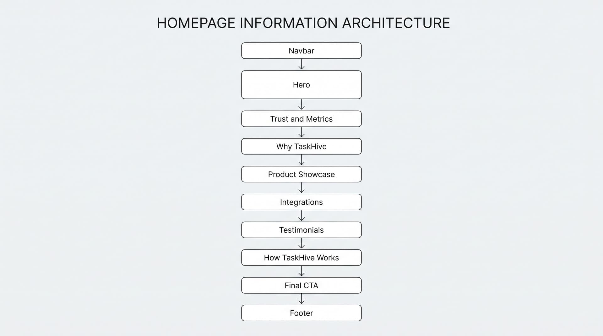
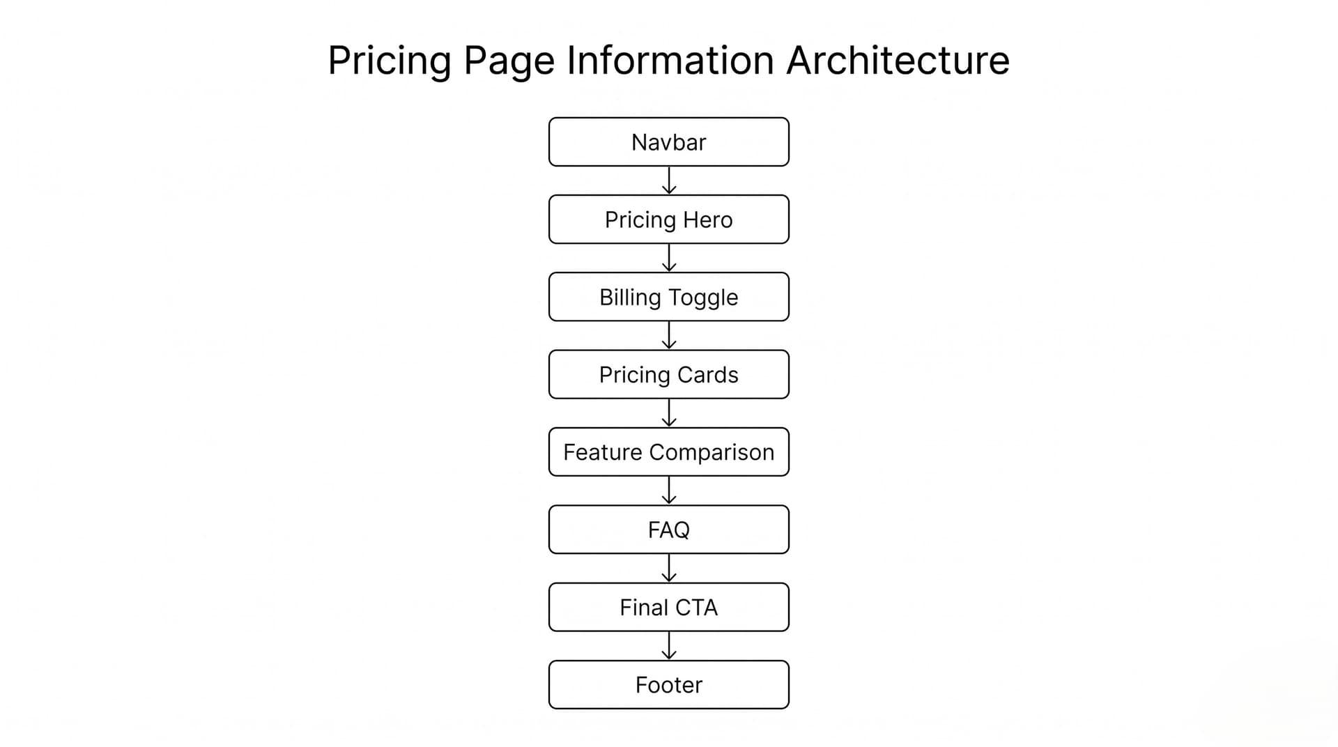
The website architecture is intentionally lean, leading visitors along a logical narrative from product capabilities down to pricing tiers and risk-free trial signups.
Homepage Structure
Pricing Page Structure
Chapter Four
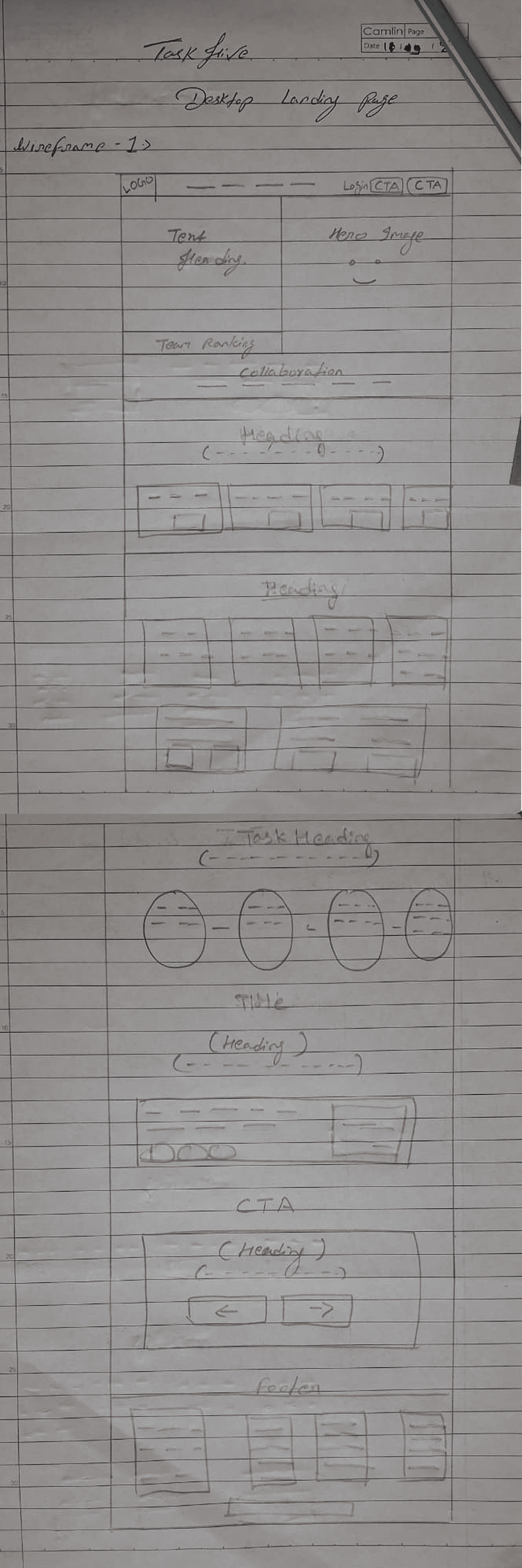
Wireframing & Layout Iterations
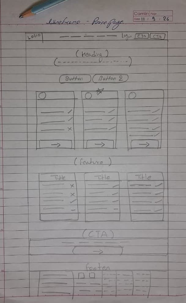
Desktop Wireframe Explorations
Mobile Viewport Wireframes
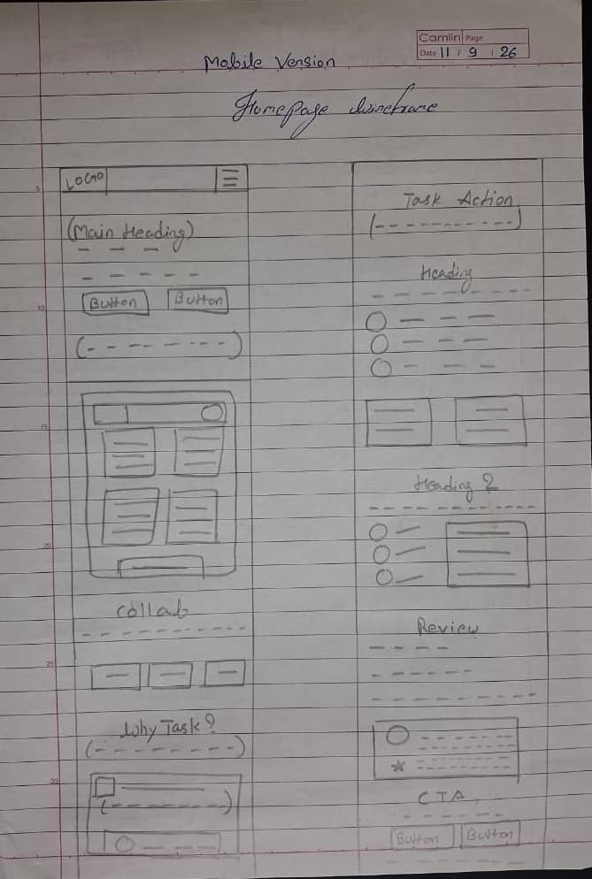
Mobile Homepage Wireframe
Mobile Pricing Wireframe
Chapter Five
Homepage Design & UX Breakdown
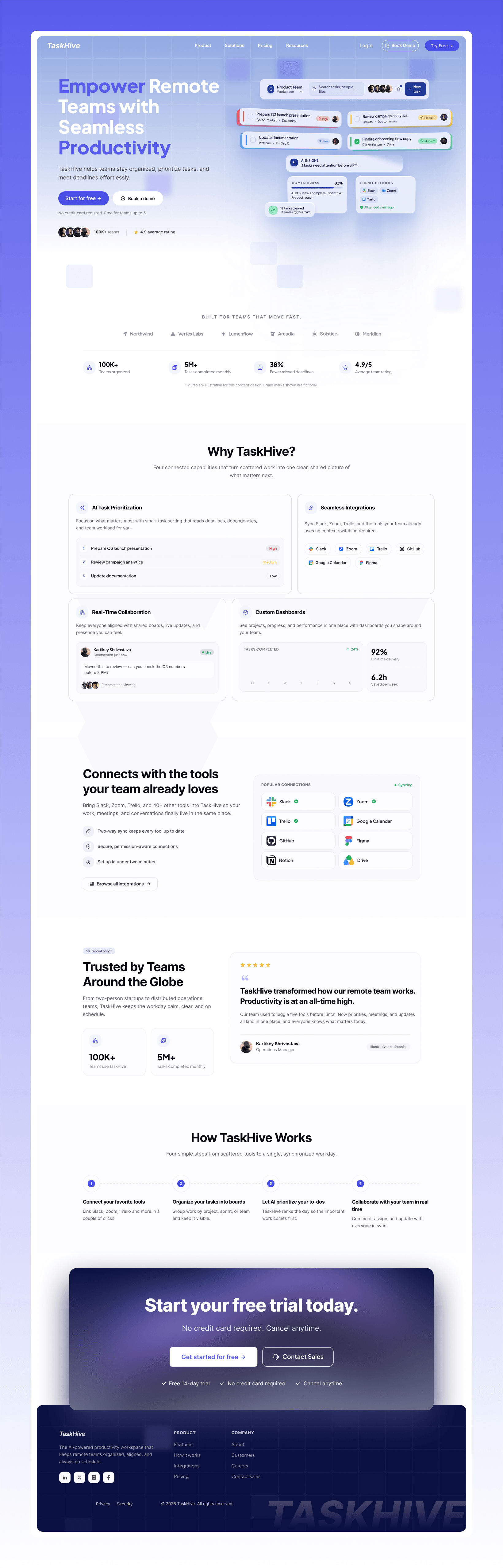
Key Desktop Decisions
- • High-contrast primary CTA anchored above the fold
- • Bento grid feature cards showcasing Slack and Zoom integrations
- • Interactive task preview illustrating live kanban board states
- • Customer quote testimonials with verified company badges
Mobile Adaptation

Chapter Six
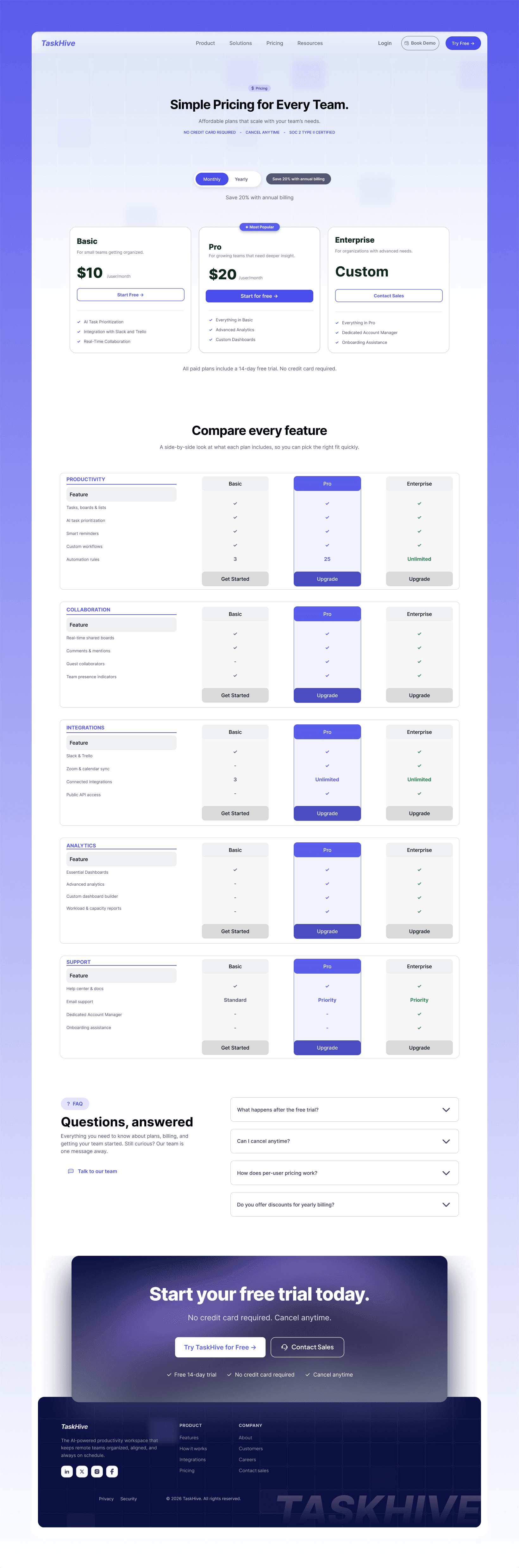
Pricing Strategy & Comparison Matrix
Pricing UX Features
- • Recommended plan visually highlighted with glowing badge
- • Monthly / Annual billing toggle with 20% discount callout
- • Comprehensive feature check-matrix grouping security & storage
- • Contextual FAQ section answering trial & refund questions
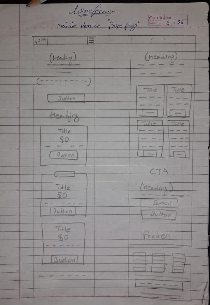
Mobile Pricing Flow

Chapter Seven
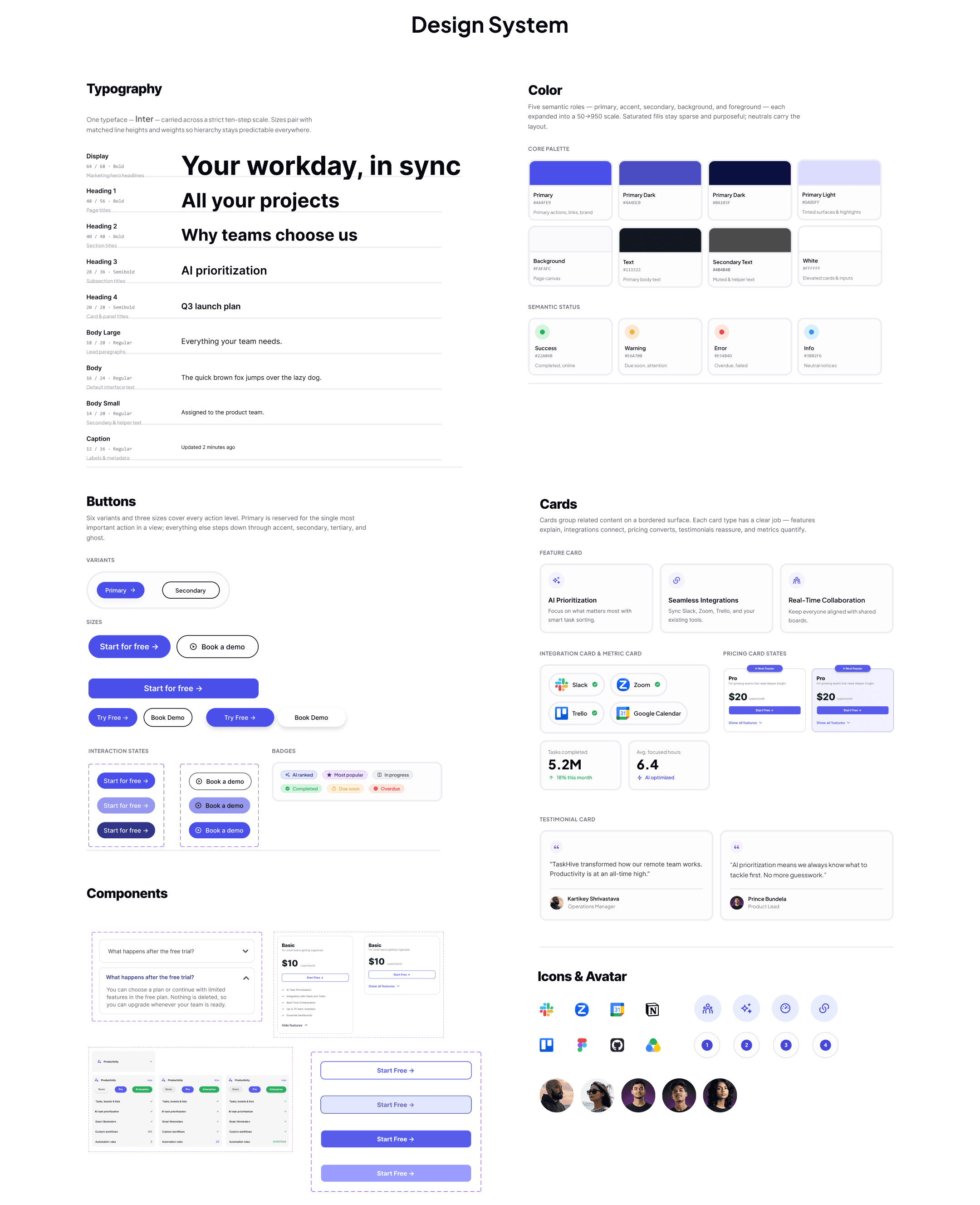
Design System & Interactive Prototype
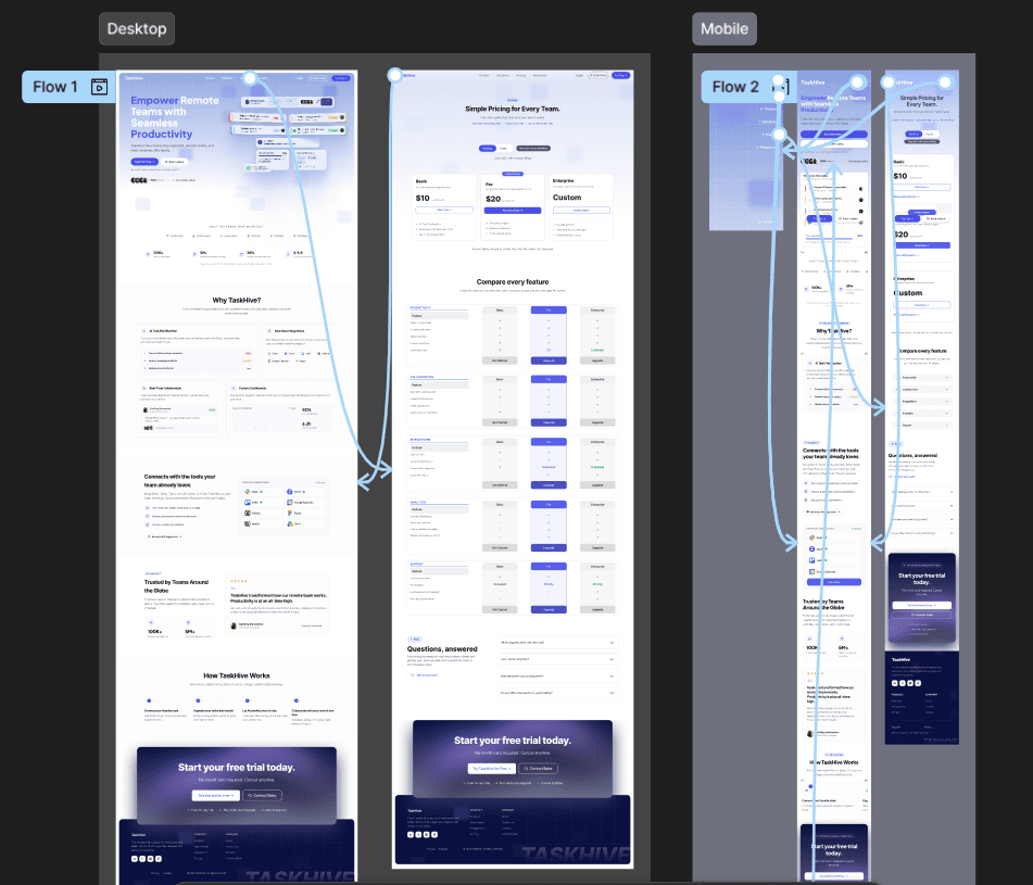
Figma Interactive Prototypes
Experience the end-to-end user journeys including plan switching, mobile drawers, and FAQ toggles.
Chapter Eight
Challenges & Solutions
Challenge
Too Much Information
Solution
Segmented complex features into bite-sized visual cards, progressive disclosures, and tabbed interfaces.
Challenge
Pricing Comparison Friction
Solution
Standardized feature naming across all plans and provided a unified feature matrix with tooltips explaining technical limits.
Challenge
Mobile Scrolling Fatigue
Solution
Replaced vertical repetition with smooth horizontal swipe containers and collapsible accordion drawers on mobile devices.
Challenge
Cross-Page Consistency
Solution
Built strict auto-layout master components in Figma with systematic typography tokens and spacing variables.
Chapter Nine
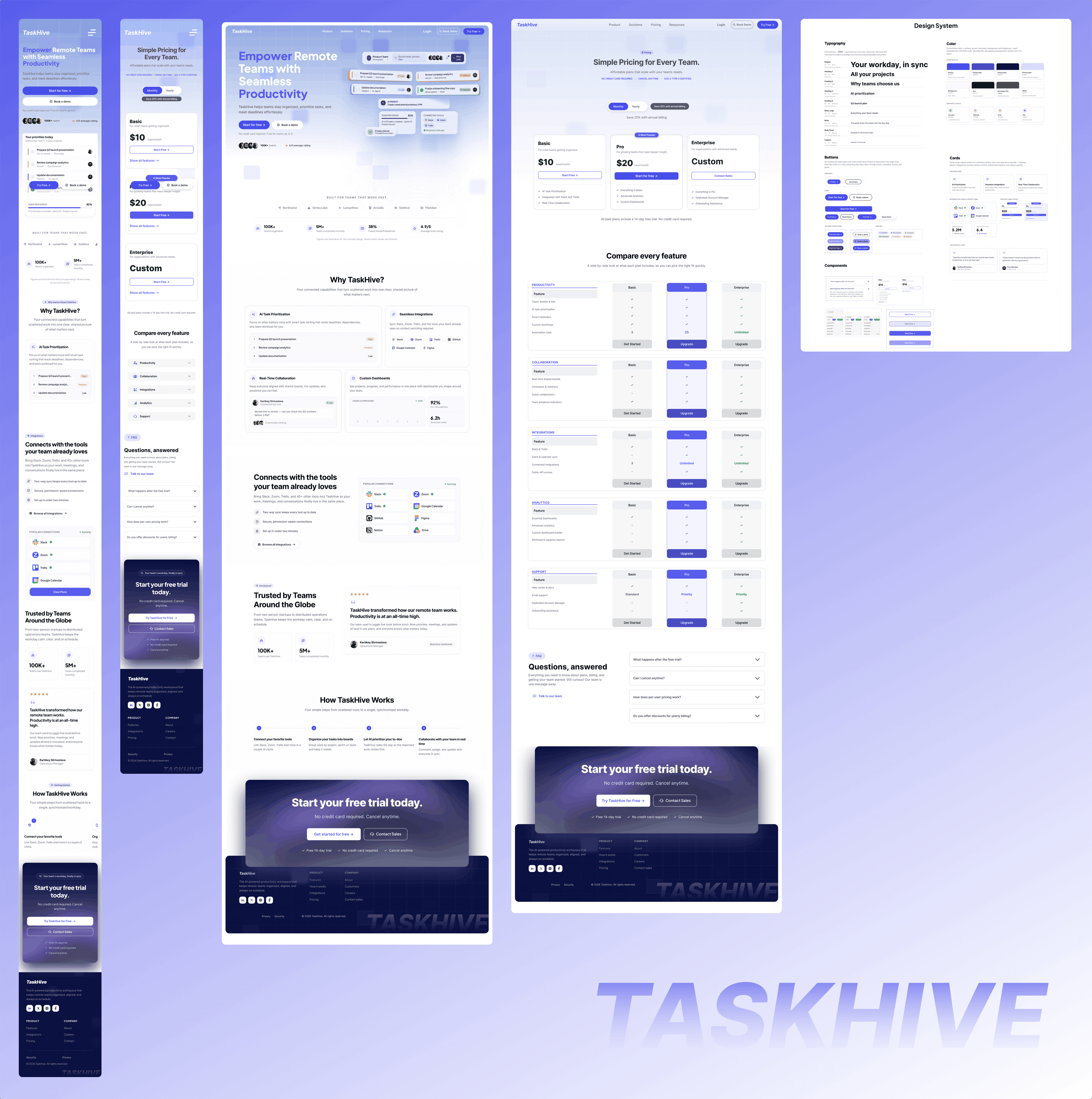
Final Outcome & Key Learnings
Designer Takeaways
Designing TaskHive sharpened my appreciation for SaaS conversion dynamics. A great product page is not just aesthetic—it balances emotional appeal with absolute pricing transparency, ensuring remote engineering leads and executives can make swift purchasing decisions.
Interested in working together?
Let's start a project