Case Study
The Strangers Meetup
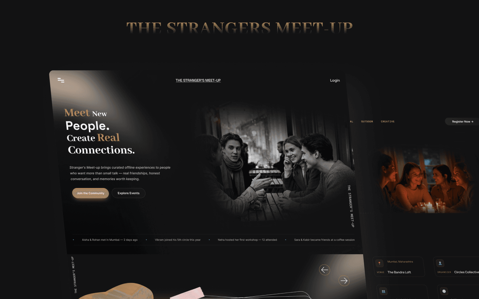
Fostering genuine offline connections through a warm, editorial community platform designed for seamless event discovery and registration.
Role
UI/UX Designer (End-to-End)
Project Type
Community Website Design
Platform
Web (Desktop & Mobile)
Status
Live Website
Tools Used
Figma, Notion, FigJam
Scope
Event Discovery, Event Details, Registration Flow & Design System
Chapter One
Project Overview & Vision
About The Project
The Strangers Meetup is a community platform dedicated to bringing people together through curated offline events. The core philosophy is grounded in simplicity: creating spaces where strangers can meet, converse, and build genuine friendships in real life.
The goal was to design an inviting digital home that transforms the hesitation of attending an unfamiliar social gathering into curiosity and excitement.
My Contribution & Responsibilities
Chapter Two
The Problem & Design Challenges
Meeting new people is socially intimidating, especially for first-time attendees who do not know anyone else in the room. A community website must do much more than list logistical details; it must establish psychological safety, clarify expectations, and eliminate ambiguity before asking someone to commit.
Brand Clarity
How can the website communicate the community’s intimate purpose in seconds?
Decision Fatigue
How can users discover and filter events without feeling cognitively overwhelmed?
Expectation Setting
How can event rules, atmosphere, and schedules be presented transparently?
Frictionless Action
How can the registration process feel lightweight, trustworthy, and fast?
Empathy & Trust
How can visual design make an unfamiliar social experience feel approachable?
Safety & Comfort
How do we reassure introverted participants about the curated format and moderation?
Chapter Three
Core Design Goals
Communicate Purpose
Clearly express the vision and safety of The Strangers Meetup above the fold.
Streamlined Discovery
Make upcoming gatherings easy to explore by date, format, and city circle.
Transparent Context
Help users mentally visualize the event structure and vibe before signing up.
Direct Conversion
Provide a seamless 2-step registration path with zero cognitive clutter.
Unified Identity
Build an editorial, warm visual brand identity across web and mobile surfaces.
Chapter Four
Visual Direction & Aesthetics
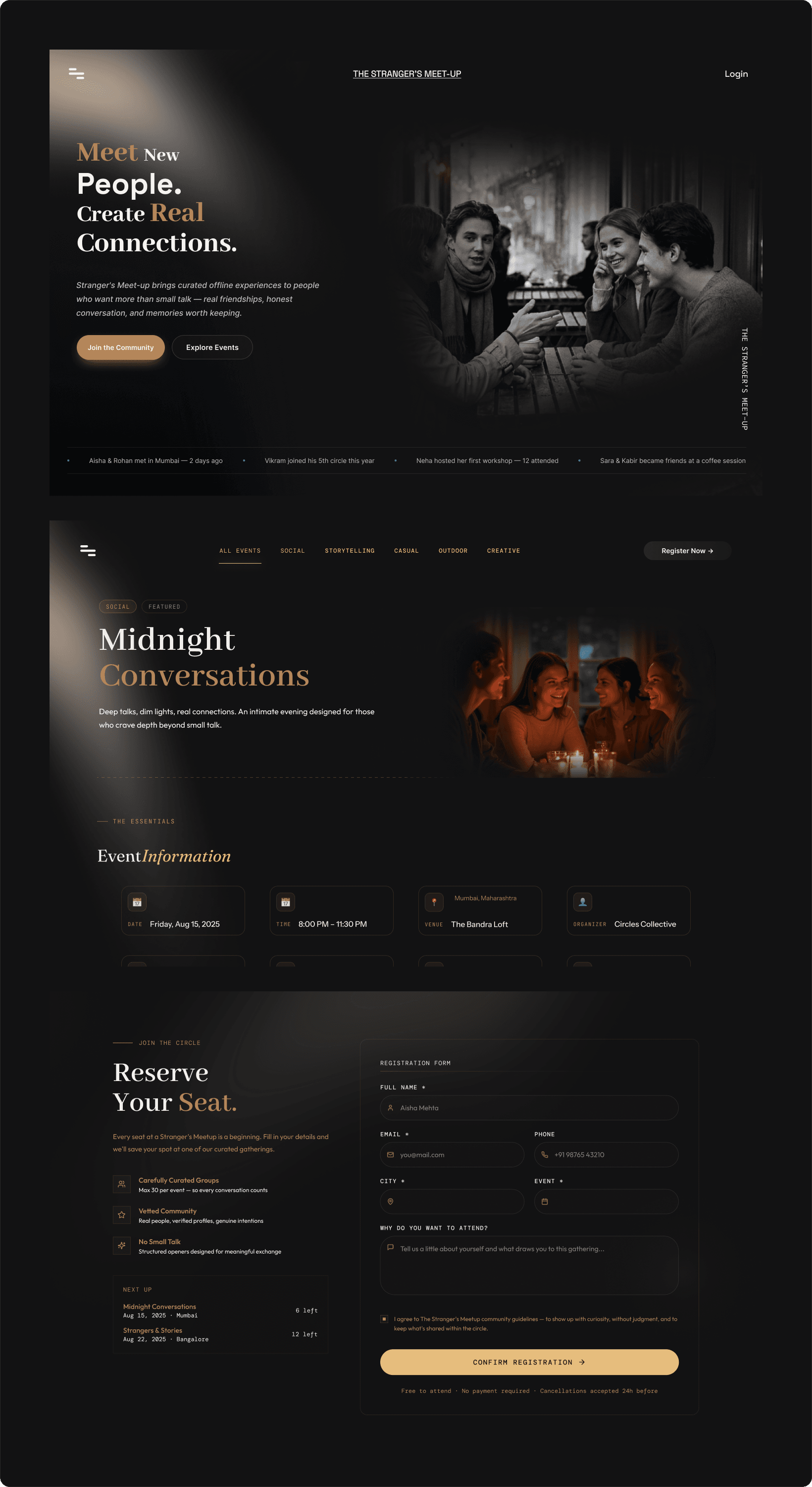
Rather than feeling like an impersonal ticketing platform, the interface was styled as a warm, curated editorial experience. Deep ambient charcoal tones, editorial serifs, and candid film photography combine to evoke the intimacy of a cozy evening gathering.
Dark Evening Palette
Creates an intimate, calm environment that reduces glare and elevates photographs.
Warm Editorial Typography
Infuses personal storytelling into every heading, distinguishing it from clinical event apps.
Authentic Photography
Showcases genuine human moments and laughter to prove that strangers easily become friends.
Chapter Five
Key Screens Walkthrough
The Homepage Experience
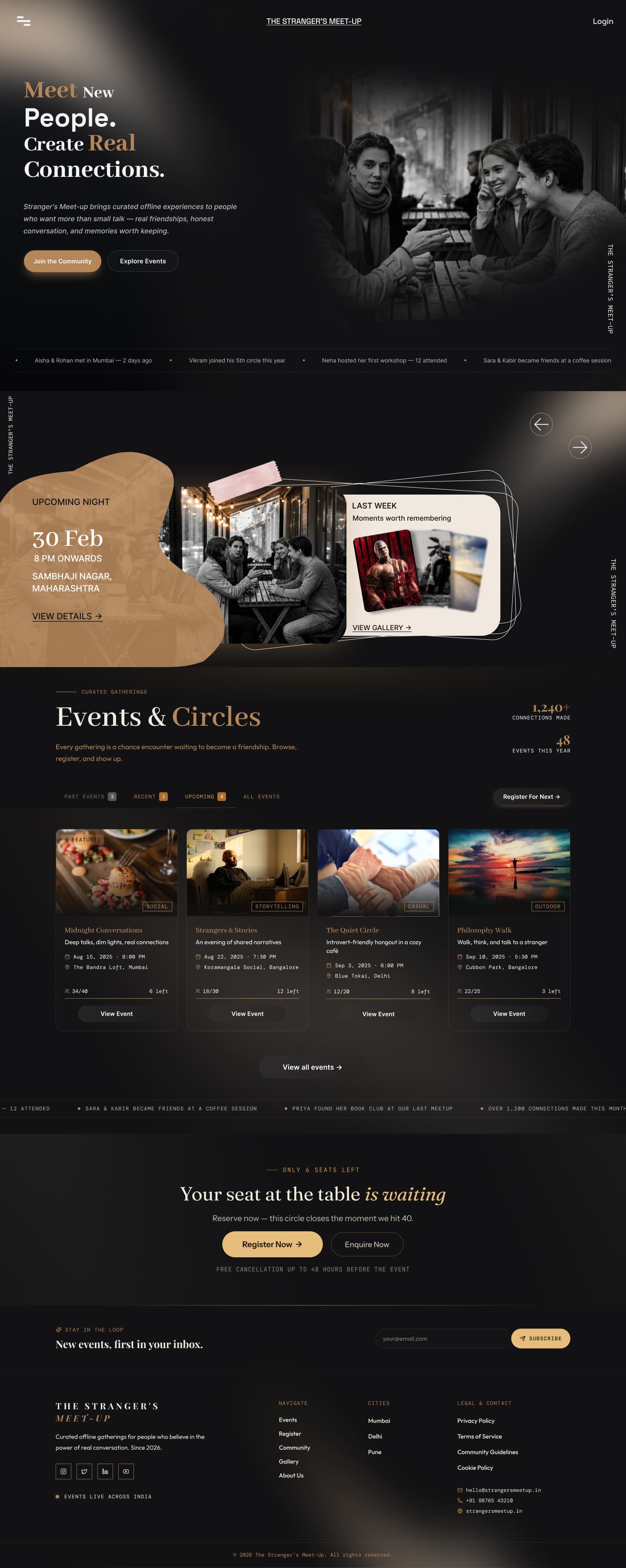
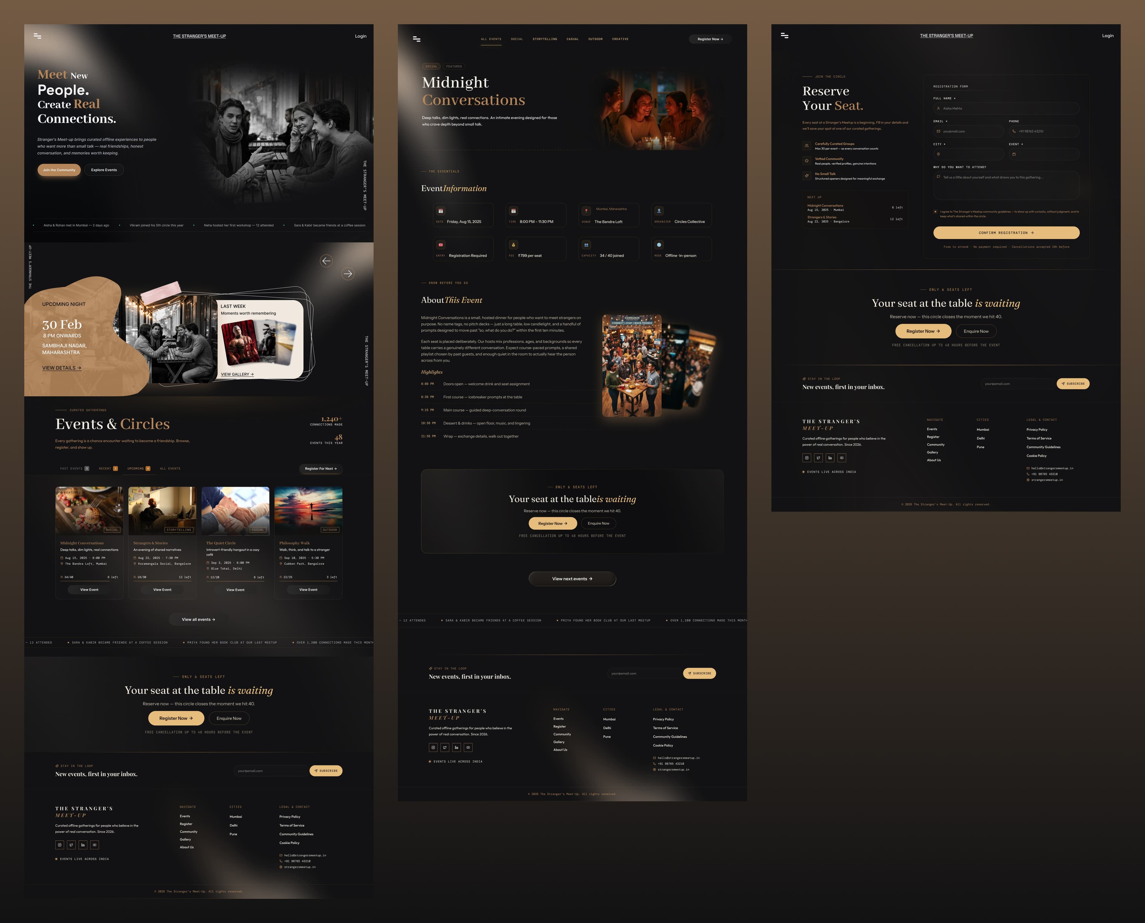
The homepage is the storytelling centerpiece. It introduces the meetup ethos, highlights upcoming circles, proves community engagement via live stats, and directs users naturally toward nearby events.
Hero Section
Punchy mission statement & primary action button
Upcoming Preview
Dynamic cards sorted chronologically
Circles & City Chapters
Sub-communities based on interests
Community Proof
Verified attendee reviews and attendance numbers
Event Details & Storytelling
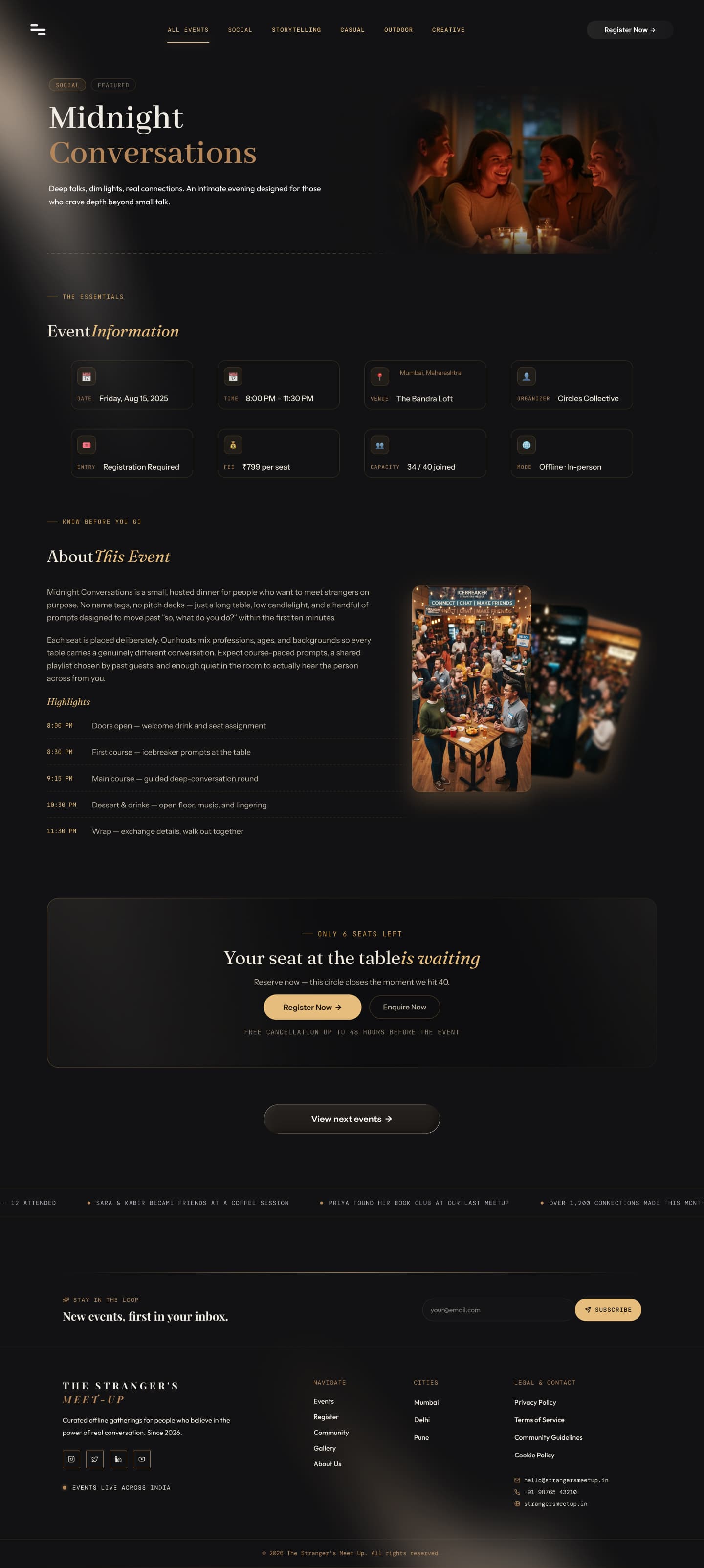
Instead of reducing the event to dry bullet points, this page immerses the user in the atmosphere with detailed timelines, host introductions, safety guidelines, and a sticky registration CTA.
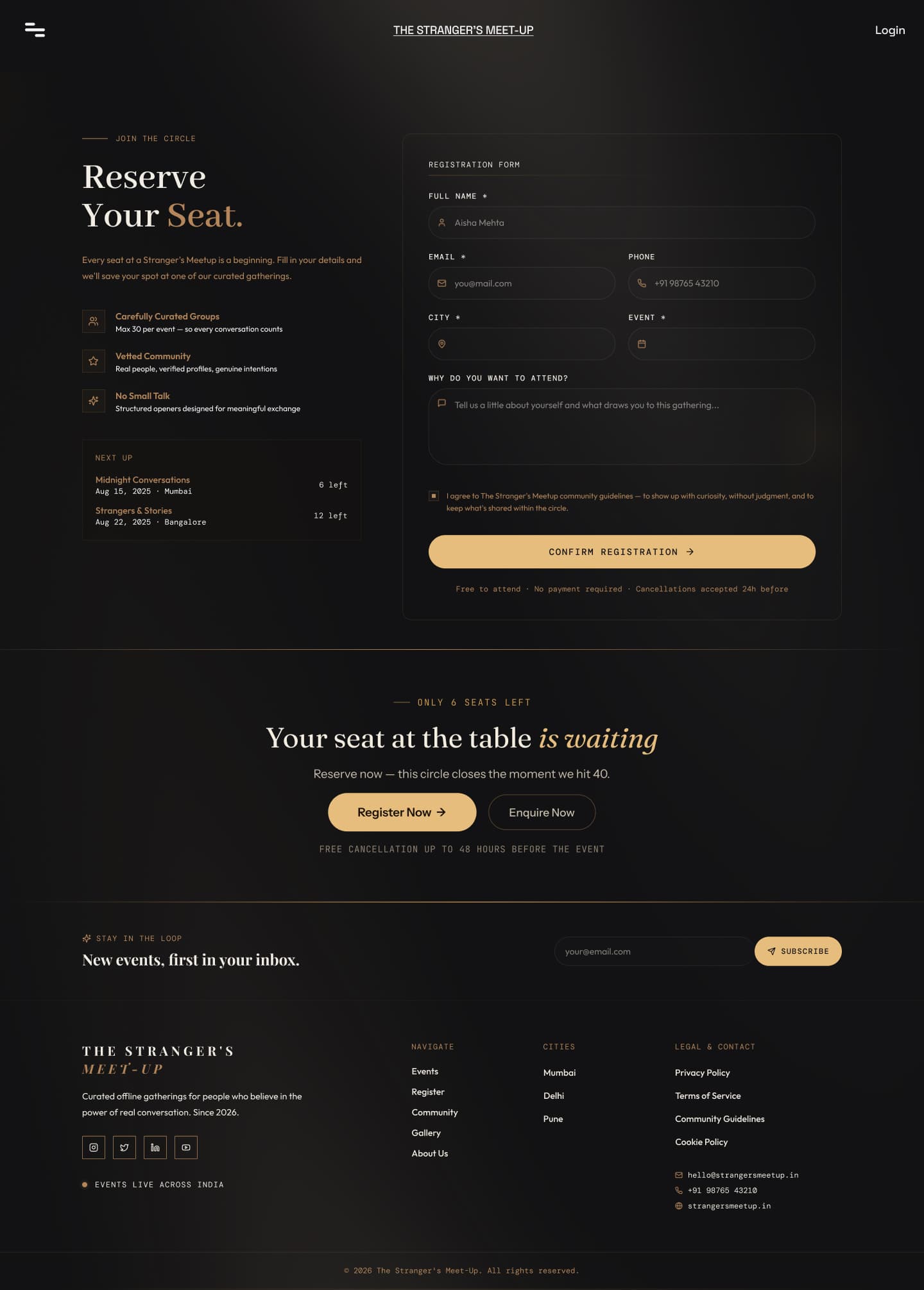
Focused Registration Flow
A distraction-free checkout experience that collects only essential information, displays live seat availability, and provides instant confirmation to maintain user confidence.
Chapter Six
Scalable Design System
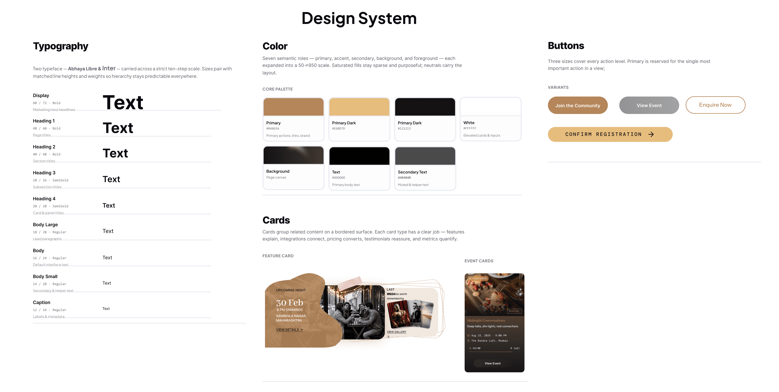
A comprehensive design system was constructed in Figma with modular components, dynamic card states, cohesive typography hierarchies, and accessible color contrasts to ensure rapid development and brand consistency.
Chapter Seven
Final Outcome & Reflection
Deliverables Summary
- ✓Responsive web application design for desktop and mobile devices
- ✓Intuitive event exploration with multi-category circle sorting
- ✓Editorial event storytelling templates with timetable breakdowns
- ✓High-converting, low-friction checkout & ticketing experience
- ✓Full Figma component library and tokenized design system
Key Learnings
- •Designing for community products requires equal parts trust-building and logistical clarity.
- •Visual atmosphere directly influences willingness to step out of one's comfort zone.
- •Clear progressive disclosure in event details removes pre-meetup anxiety for first-time attendees.
- •Cohesion across typography, photography, and form elements delivers an unmistakable brand signature.
Interested in working together?
Let's start a project